Pay Attention to CRAP!
If you want to convey a message efficiently and effectively, you need to use CRAP (contrast, repetition, alignment, proximity) to your advantage. The CRAP concept is typically applied to graphic design. However, it doesn’t just come into play when you’re creating slick magazine ads, brochures, or billboards. CRAP is just as important when you’re producing text-heavy materials like memos and instruction manuals. Why? If your audience can see, it is receiving information visually as well as verbally. So, the visual elements—which include text formatting—should also convey or reinforce the main message and other key content rather than detract from it.
Here’s How CRAP Works
Contrast, according to Oxford Languages, is “the state of being strikingly different from something else in juxtaposition or close association.†In the marketing piece shown here, the most noticeable contrasts are between colors, values, font sizes and styles, and placement. Can you spot these contrasts? Can you appreciate how much they help to communicate the company’s main message?
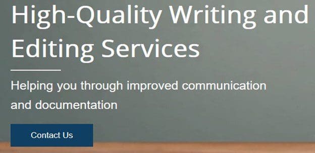
If you were to view the same content without the aid of these contrasts, you wouldn’t grasp the main message as quickly and easily—you might not even understand what it is!
Repetition refers to the reuse of identical or similar elements in a piece. When used well, these elements enhance the clarity and navigability of content. For example, the green pencil icons help to set off each item on this list of qualifications. Their equal size and uniform color and shading also communicate that each item is of equal value.
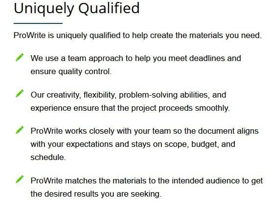
Imagine that list without any icons—not even bullet points—to denote each point. Would each item stand out as distinctly? Would the items still grab your attention? Most likely, they would look like too much text to bother reading.
Next, imagine that green color being repeated systematically to guide your eye to key points on a larger website or brochure page. The repetition of a color, a symbol, or even a particular font size and style—think subheadings—are all effective tools for subliminally directing people’s attention.
Alignment refers to the intentional positioning of objects—including lines or blocks of text—so that their edges (left or right, top or bottom) or their center points line up. A well-aligned page, ad, or marketing piece is easier to scan and usually strikes viewers as being well organized, clean, and aesthetically pleasing. These virtues of alignment are what make it preferable to hang-indent items on a list, such as the one you just examined, and to use charts and tables to present dense text. Viewers rarely realize consciously that these are the effects of good alignment.
Misalign something, though, and most viewers will be drawn to that spot, disturbed by the misalignment, and perceive the piece as flawed or sloppy. Fail to pay attention to alignment completely, and the result is a design that will likely look so messy that it obscures key points and confuses readers.
On the web page shown here, a designer used alignment to enable users to easily distinguish and access text with different functions.
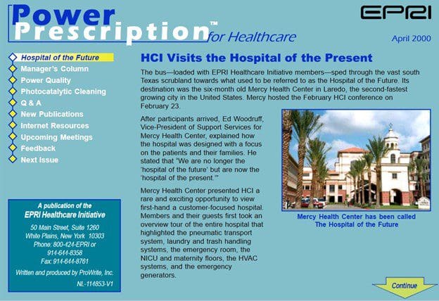
Proximity in design refers to the nearness of elements in space. In general, related elements should be positioned near one another—even clustered or grouped—and farther from unrelated ones. For example, on this web page all the menu options are listed closely together and set apart from the article text. Likewise, the caption beneath the photo is proximal to the image it describes (and a different color from the text in the body of the article) so it is not mistaken for stray article content. Its proximity shows that it belongs to the image.
​In general, if you see a line of text that looks like it could belong to more than one item, it’s a good idea to use spacing to show where it belongs.
How to Use CRAP
As you may have noticed, all but the intentionally poor example in this blog post made good use of every piece of CRAP. For instance, even if you just quickly scan that last example you should see that the person who created the web page used contrast, repetition, and alignment in addition to proximity. Doing that should also be your goal: in all your communications, use every piece of CRAP you can! Or, hire a high-quality writing and editing company such as ProWrite that will pay attention to CRAP for you.
Posted in Blog